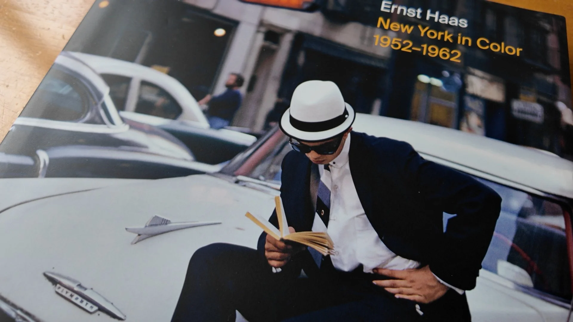
Exploring Ernst Haas’ Kodachrome Colors: Recreating His Style with Fujifilm
Ernst Haas: A Master of Color and Motion
One of the most inspiring figures in the world of photography for me has been Ernst Haas. His bold use of colour, mastery of composition, and his ability to capture the dynamic energy of life through motion have set him apart as one of the most innovative photographers of the 20th century. What particularly captivates me about Haas’ work is how he embraced colour photography at a time when black-and-white was still the dominant medium. His mastery of Kodachrome film stock allowed him to achieve strikingly vibrant images, particularly in the reds, yellows, and deep shadow areas, which have since become legendary in the world of photography.
As someone who’s just starting to explore street and documentary photography more seriously, Haas’ work has inspired me to seek out my own way of using colour and motion in the streets. I’ve been using the Fuji X100Vi and XT5, and I’ve become fascinated with the idea of trying to replicate Haas’ iconic Kodachrome colours using Fuji’s film simulations. My goal is to create images with those rich reds and yellows, alongside deep, dramatic shadows, while also experimenting with motion blur—just as Haas often did to convey a sense of dynamism and movement.
In this post, I’m going to dive into Haas’ influence on my work, how I’m attempting to emulate his style using modern digital tools, and my plans to head out with my Fuji cameras to test out some of these techniques, including two Fuji X Weekly film recipes: Kodachrome 64 and McCurry’s Kodachrome.

Who Was Ernst Haas?
Ernst Haas was born in Vienna in 1921 and initially studied medicine before turning to photography after World War II. His first significant work, documenting the return of Austrian prisoners of war, caught the attention of Robert Capa, who invited him to join Magnum Photos in 1949. From there, Haas embarked on a career that would change the course of photography forever.
What set Haas apart from other photographers of his time was his groundbreaking use of color photography. During the 1950s and 1960s, color was often seen as less serious, less artistic than black-and-white. But Haas embraced color as a creative tool in ways that few had before. His images, particularly his work with Kodachrome film, are renowned for their vibrant, saturated colors and deep contrasts, particularly in the reds, yellows, and the way he used shadow to create depth and drama in his compositions.
Haas’ ability to depict movement—whether in his dynamic street photography, his abstract work, or his iconic motion-blur images—has left a lasting influence on me as a photographer. I’m continually inspired by how he captured the essence of a moment through the blur of movement or a dramatic play of light and shadow, which is something I aim to bring into my own photography.

Kodachrome: The Film of Legends
Kodachrome, the film stock Ernst Haas used extensively, was produced in three versionsover its lifetime. Each version had its own characteristics, but Haas is said to have preferred the original version, which had an ISO rating of 8. This extremely low ISO likely played a significant role in how Haas approached his photography. An ISO of 8 meant that his shutter speeds had to be correspondingly slow unless he was shooting in bright light. This naturally led to the incorporation of motion into his images, as the slow shutter speeds allowed for creative blurring, giving his photos a unique sense of energy and movement.
The second version of Kodachrome, with an ISO of 25, was also favored by Haas as he adapted to different lighting conditions while still maintaining the film’s trademark color vibrancy and contrast. However, as Kodachrome evolved, the third version of the film became the most well-known. Produced from 1974 to 2009, the ISO 64 version of Kodachrome became legendary for its more vibrant colors, particularly in the reds and yellows, and the stunning depth of its shadows.

My Search for the Perfect Kodachrome Simulation on the Fuji X100Vi and XT5
As much as I would love to shoot with actual Kodachrome, the film is no longer available. Instead, I’ve been exploring ways to replicate its color profile using modern digital tools. Fortunately, Fujifilm has made this process much easier with their film simulations and the incredible community around Fuji X Weekly, which offers custom film recipes designed to mimic the look of classic film stocks.
To capture the vibrant colors and deep shadows of Kodachrome in my own street photography, I’ll be testing two Fuji X Weekly recipes: Kodachrome 64 and McCurry’s Kodachrome. Both recipes aim to replicate the look of Kodachrome 64, the third and final version of the film, which Haas didn’t shoot with but shares many of the qualities he valued in earlier versions, particularly its rich colors and bold contrast.
Kodachrome 64 Film Recipe
The Kodachrome 64 recipe is based on the iconic color slide film that photographers like Steve McCurry and Haas helped make famous. This version of Kodachrome was renowned for its rich, warm colors, especially in the reds and yellows, and its balanced contrast between highlight and shadow detail.
Fuji X Weekly’s Kodachrome 64 recipe uses Fujifilm’s Classic Chrome as its base and adjusts elements like the white balance, shadow tone, and highlights to create an image that feels close to the Kodachrome aesthetic. While this recipe doesn’t perfectly replicate the exact look of Haas’ early work, it comes close to capturing the vibrancy and depth that he so masterfully achieved with the film.
Here are the Kodachrome 64 settings I’ll be using:

McCurry’s Kodachrome
Inspired by the work of Steve McCurry, one of the most famous users of Kodachrome film, this recipe offers a slightly different take on the Kodachrome look. While the warm tones and vivid colors remain, McCurry’s Kodachrome recipe emphasizes even deeper shadows and more saturated colors in certain situations. It’s perfect for urban street photography, where the interplay between light and shadow can add drama to an image, and it mirrors the kind of bold, energetic colors that Haas often captured in his street scenes.
As I go out to test these recipes, I expect I’ll tweak the settings to suit the conditions I’m shooting in, and over time, I hope to craft my own personalized Kodachrome look that combines elements of both Haas’ and McCurry’s iconic styles.
Drag the Shutter: Emulating Haas’ Motion
Another hallmark of Haas’ style was his use of motion blur to convey a sense of movement. Whether it was traffic rushing by or pedestrians in mid-stride, Haas used slow shutter speeds to create a dreamy, dynamic quality in his photos. This likely stems from his use of the original ISO 8 Kodachrome film, which required slower shutter speeds even in daylight.
To emulate this, I’ve been experimenting with dragging the shutter on my Fuji’s—keeping the shutter open just a fraction longer to allow the movement of the scene to blur slightly while keeping the main subject sharp. This technique can be tricky but, when done right, it adds an extra layer of energy to the image, something Haas was a master of.
I’ve been practicing this technique, particularly in areas with a lot of motion, like people walking through busy streets or vehicles moving through intersections. This dynamic use of motion is a key element of what made Haas’ work so revolutionary, and it’s something I aim to bring into my own photography.

With all of these ideas in mind, I’m planning to keep heading into Coventry with my X100Vi and XT5 to test out these techniques. Coventry, like so many British cities of similar size, is on the decline but has an interesting mix of old and more modern brutalist architecture. The British high street in most towns is dying off with far fewer people visiting these locations than in the past so the challenge will be in finding subjects to capture on the streets.
I’ve found that this film recipe really needs good light to start to reproduce the colours that I am after. Luckily I got one good day this week in which I could go out in Coventry and play around with the settings. I couldn’t find any red subjects which I was particularly looking for. I’m heading to London this week with my daughter for a mini vacation. Most of my time will be spent showing her the sights but if I get the chance I’ll try and grab a few shots while I’m there and update this article if appropriate.